bite squad dental nyc
Where the Smile Story Begins
My Role
During Covid 19, I was grateful for the opportunity to begin working with what was then known as Pediatric Dentistry NYC, which has since rebranded to Bite Squad NYC. I came on during a pivotal transition period and have continued to support the brand as it evolves. Today, I still maintain a strong working relationship with the team and actively contribute to its ongoing growth and development.
Tiny Teeth, Big Beginnings
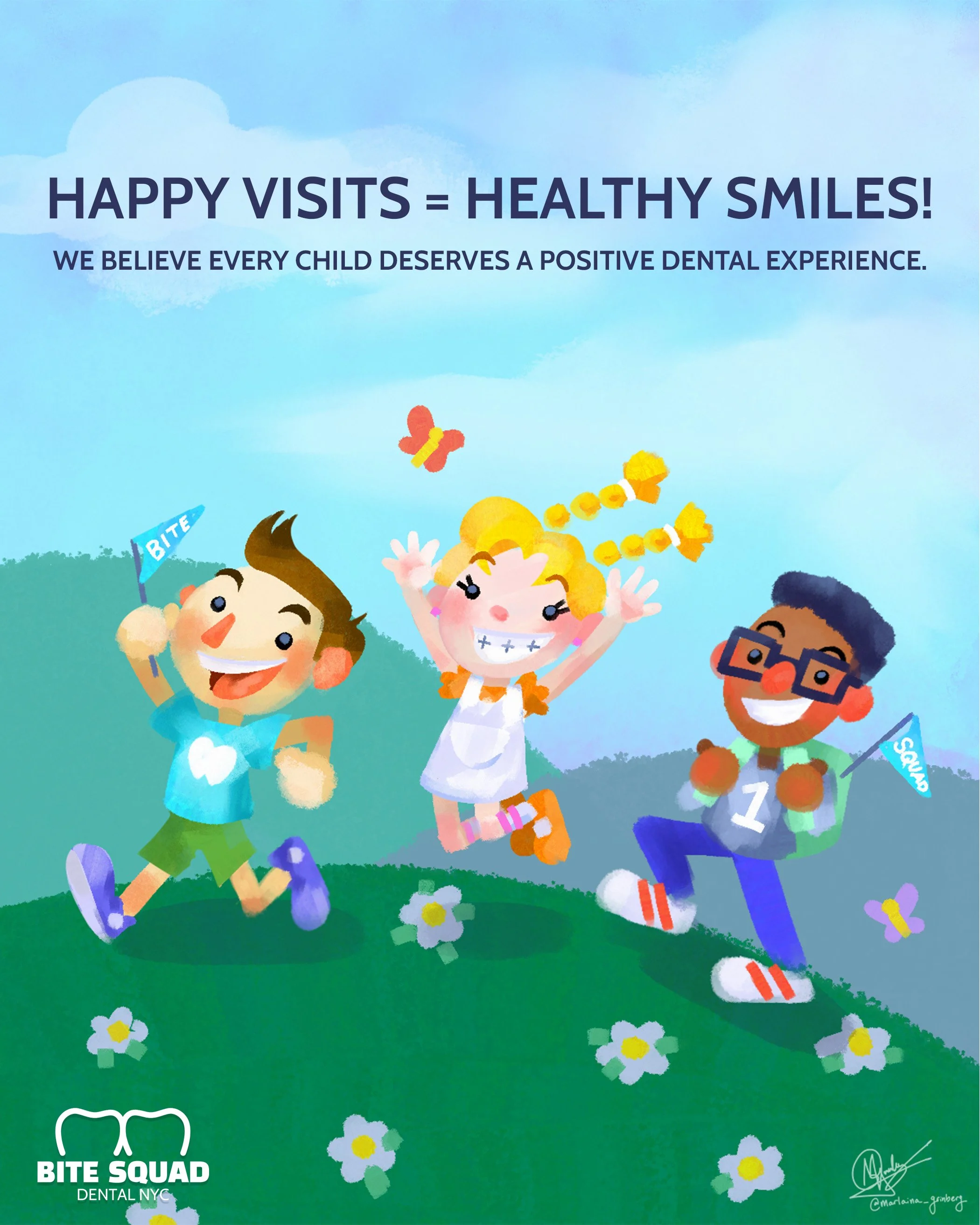
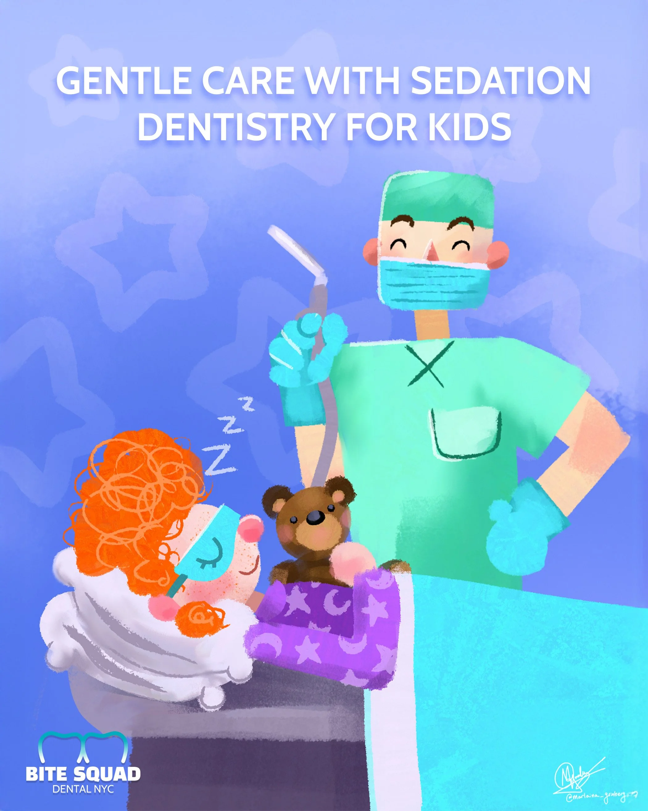
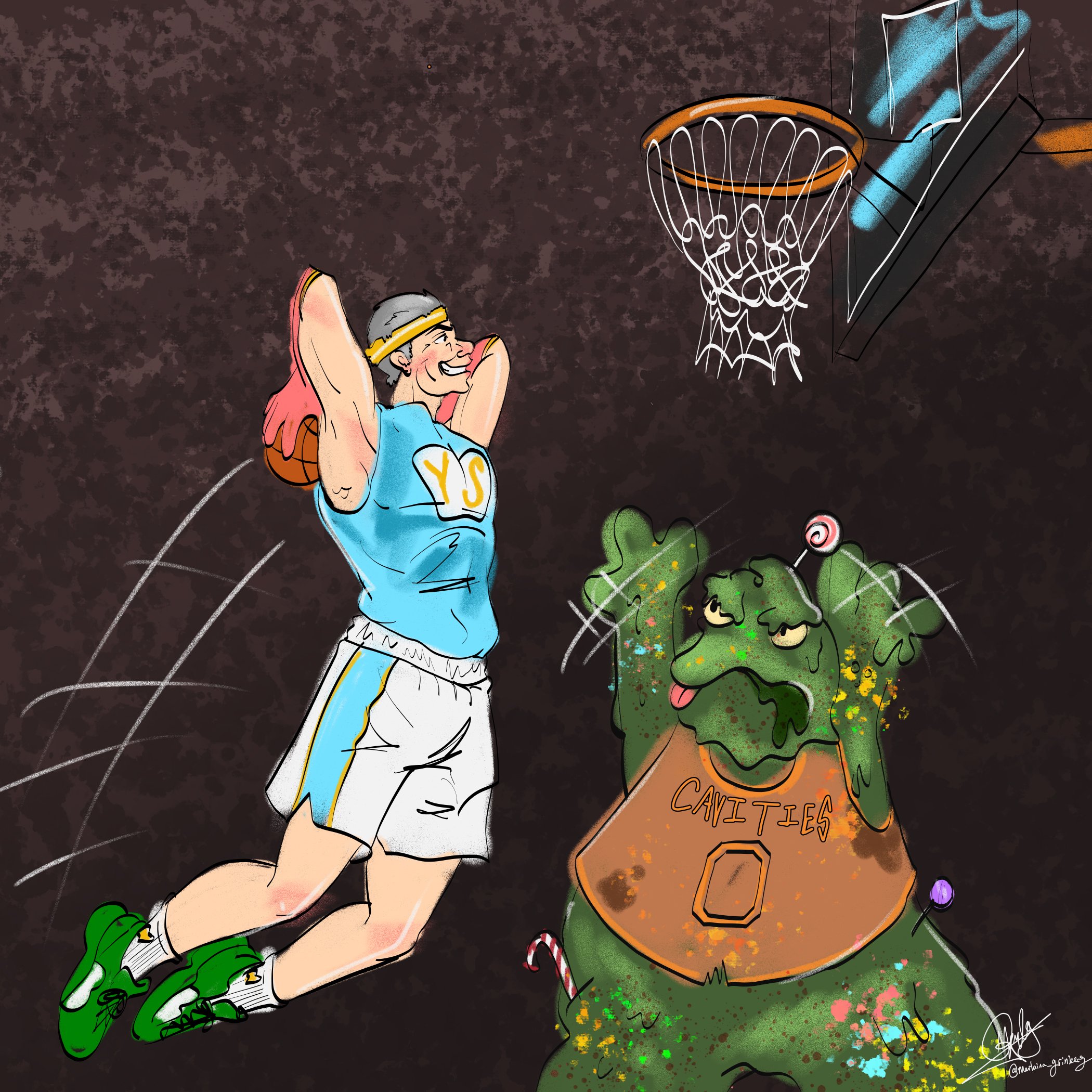
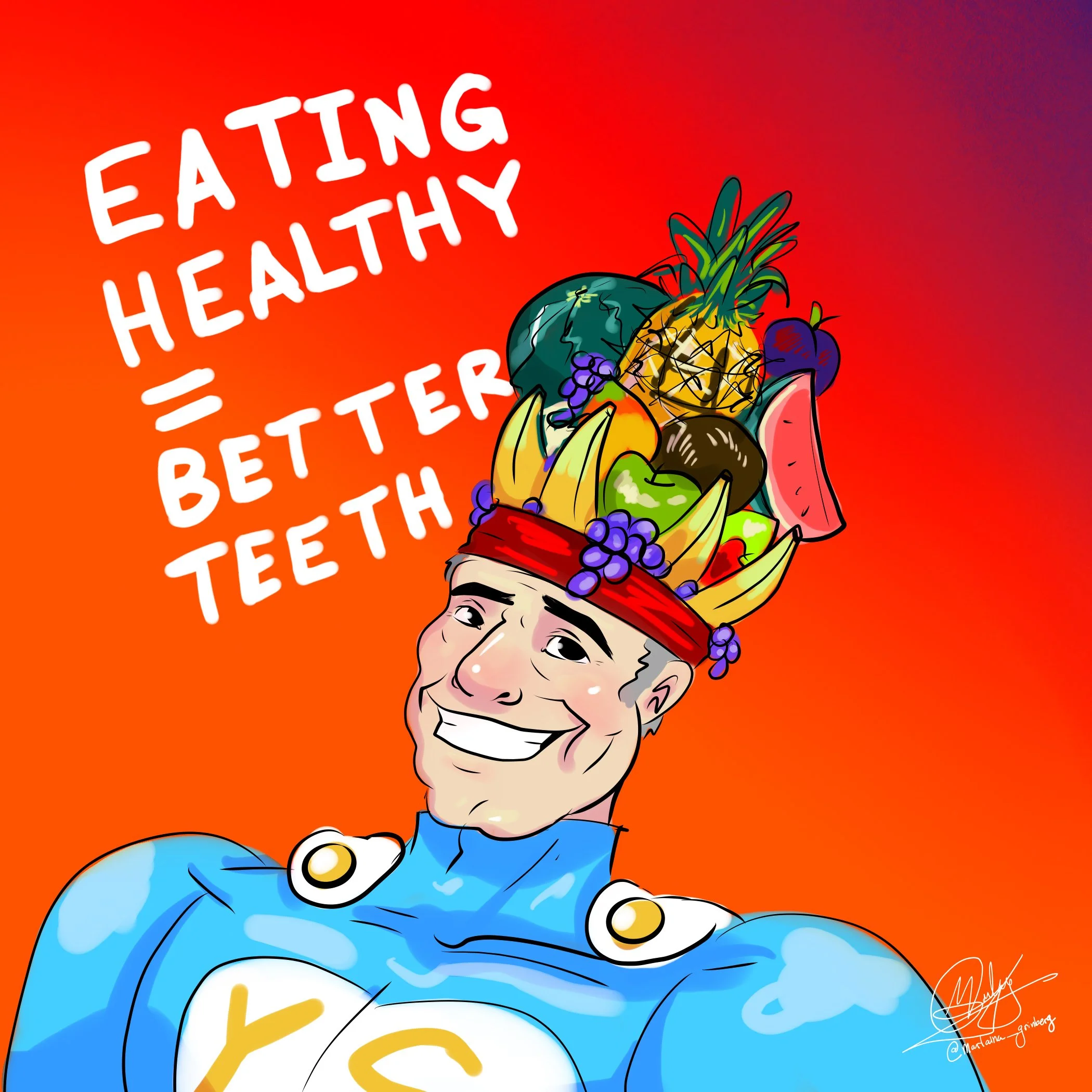
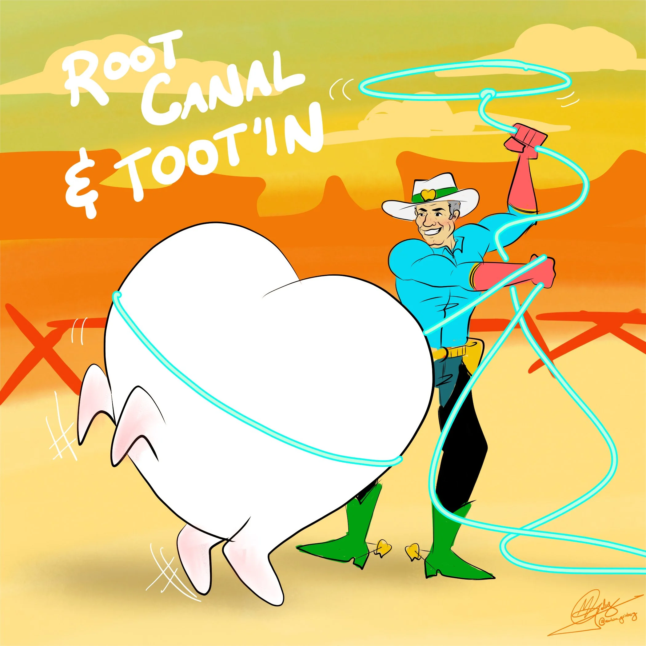
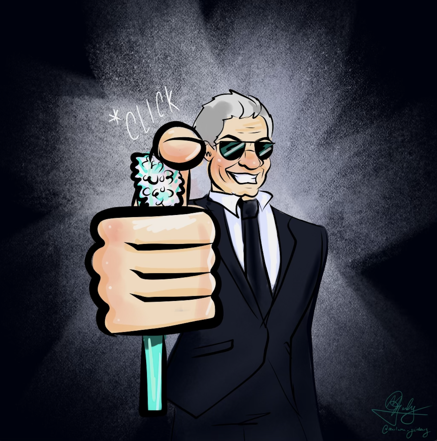
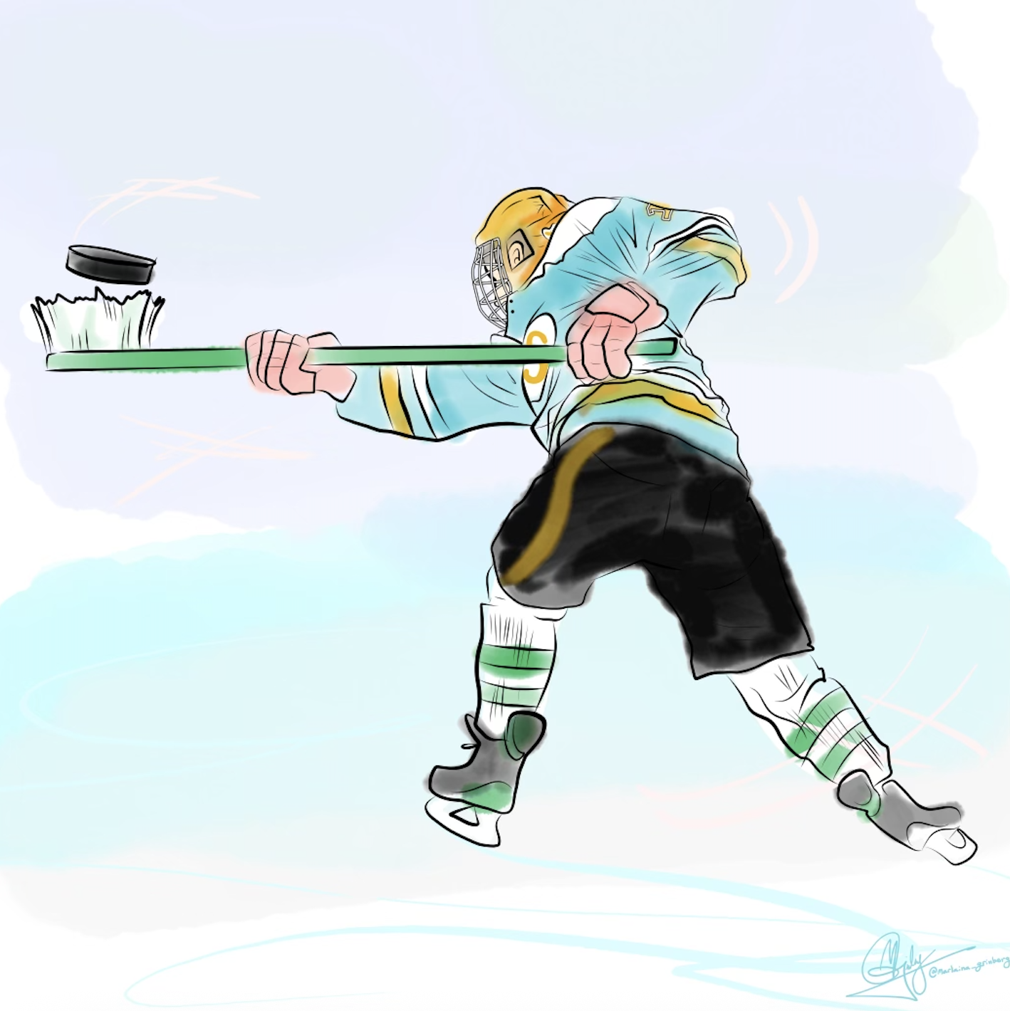
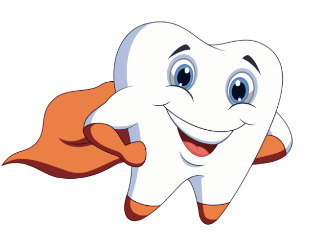
At the beginning of this journey, my main focus was creating weekly hand-drawn digital illustrations for social media. The concept was to turn the lead dentist into a superhero, playing off a DC and Marvel-inspired theme. After developing the character design, I began sketching and rendering custom graphics each week, bringing the persona to life in a fun, engaging way that fit seamlessly with the brand’s playful identity.
I was lucky to have full creative freedom with the illustrations, which allowed me to really experiment and push ideas. I focused on making each piece feel original and vibrant, leaning into my humorous, cartoony style to present the brand as playful and welcoming. The goal was to show kids that a dentist’s office can feel fun and comfortable, not intimidating. By rotating concepts, visual themes, and creative approaches, I kept the feed dynamic and engaging while still maintaining a strong sense of personality.
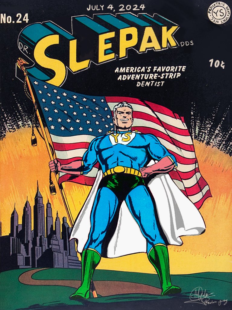

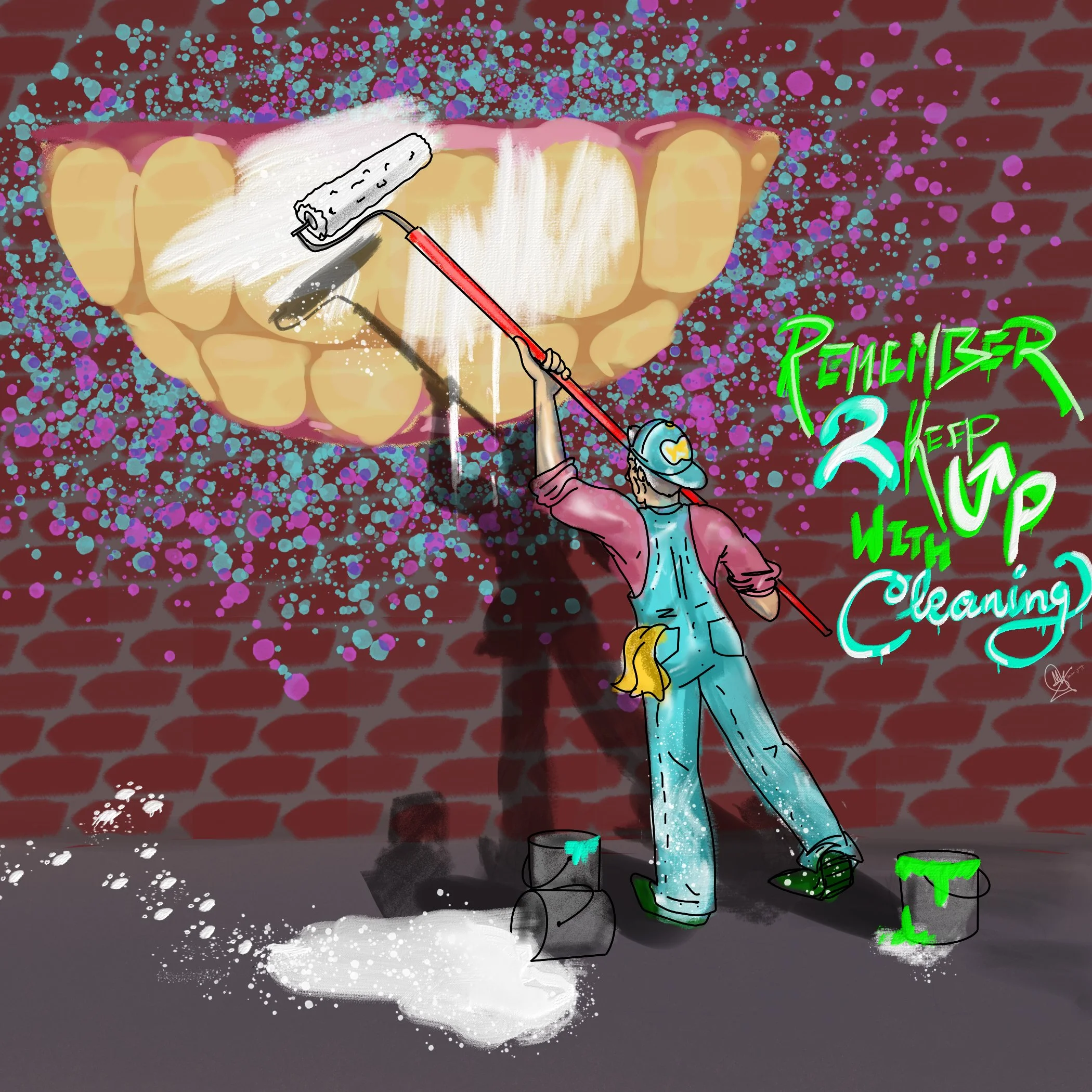
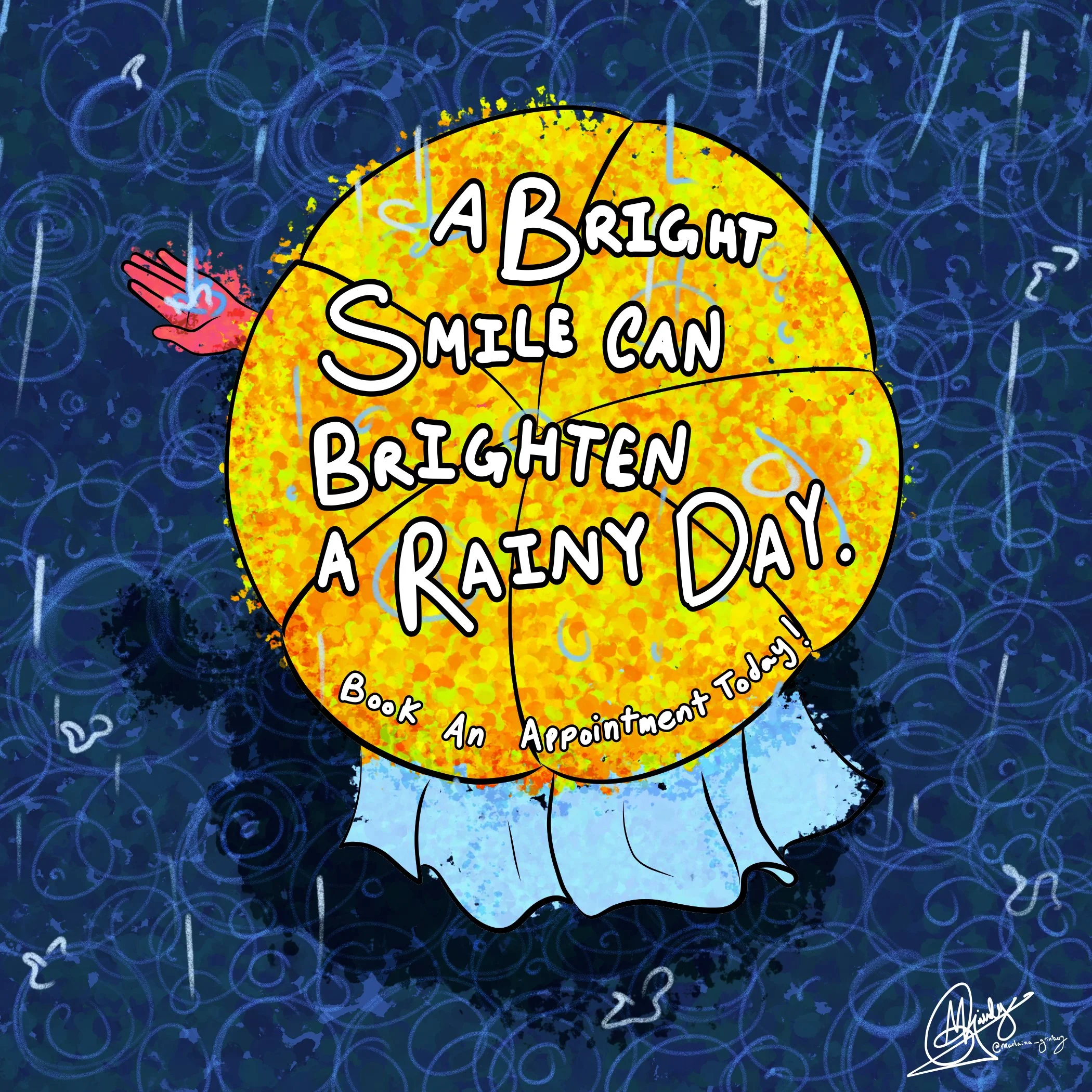
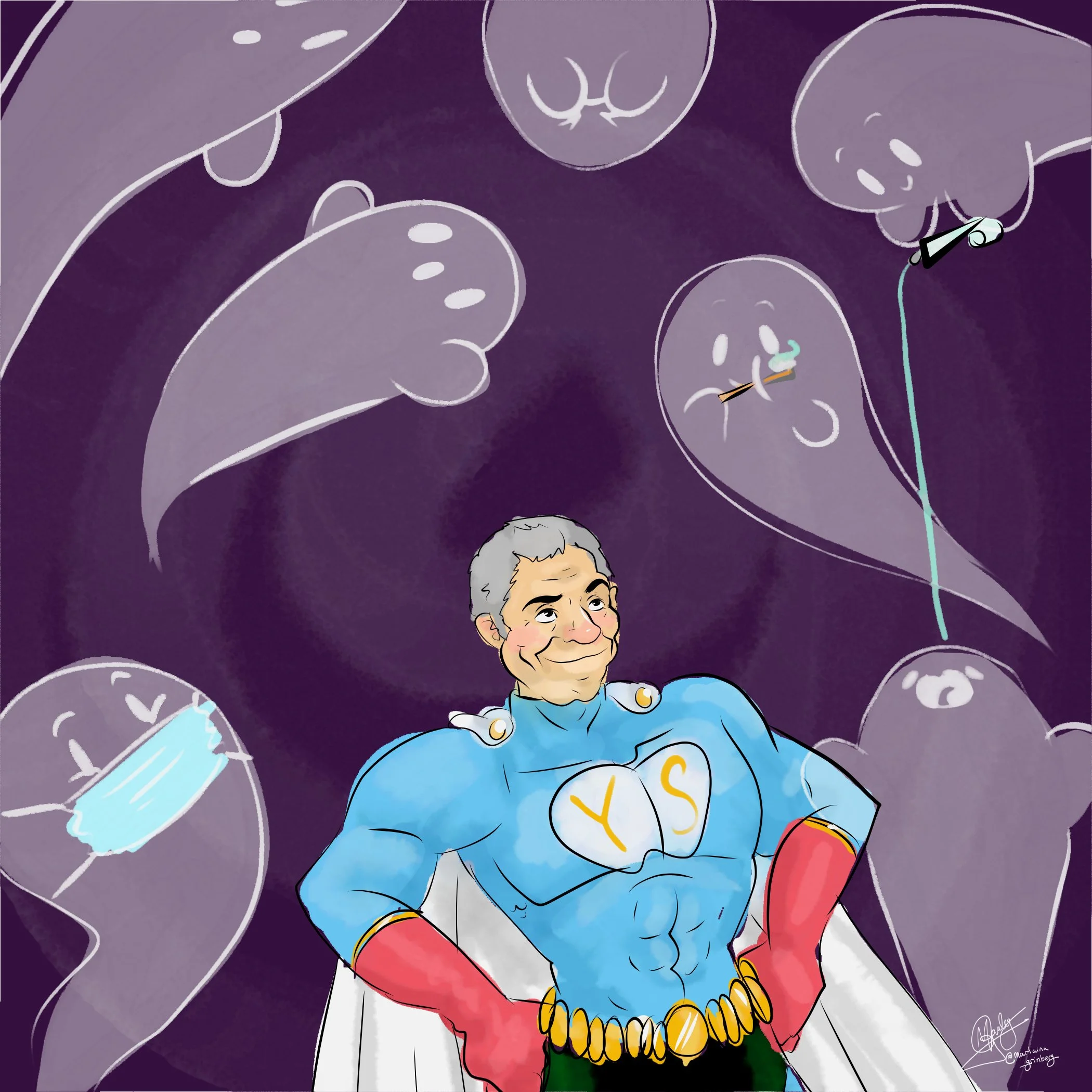
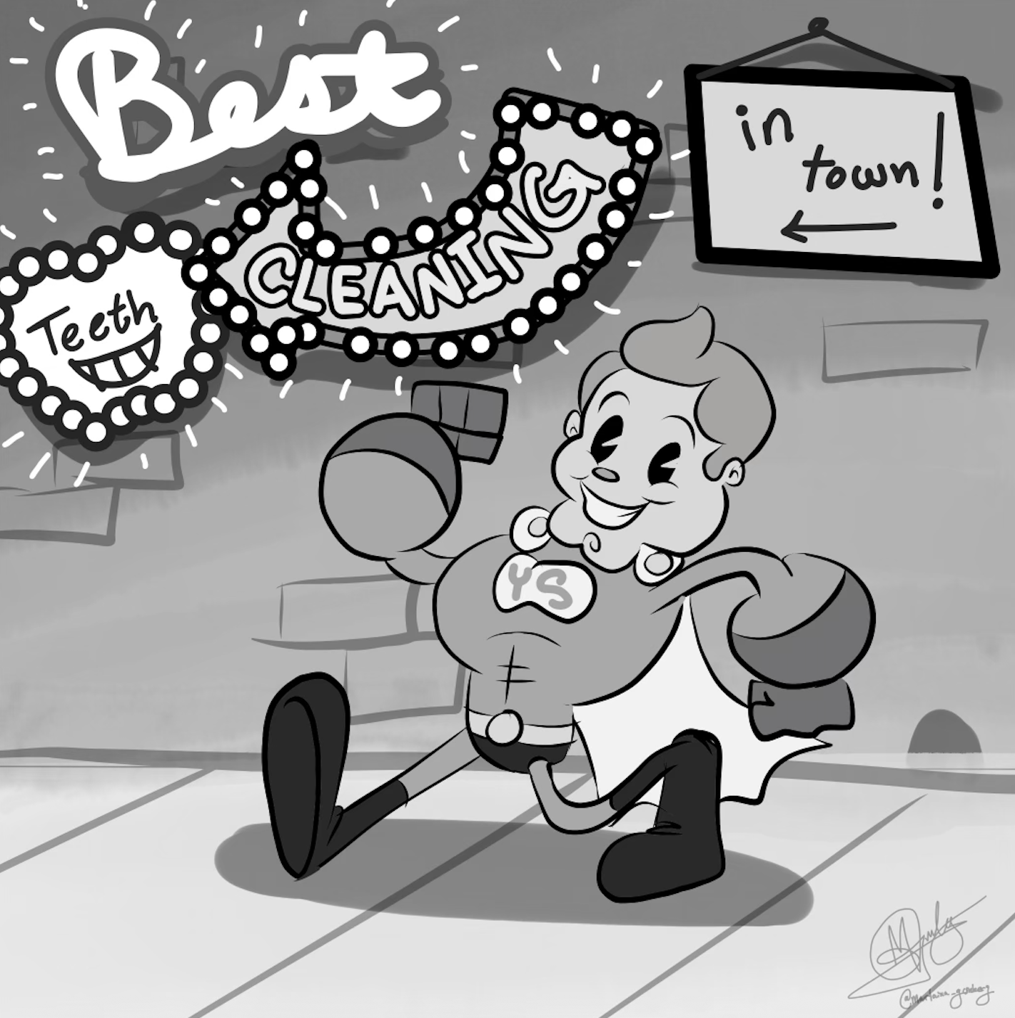
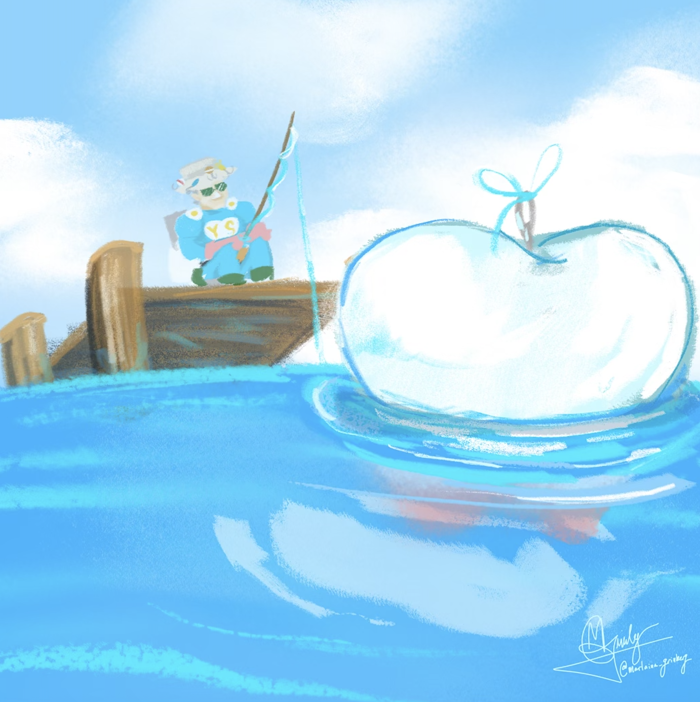
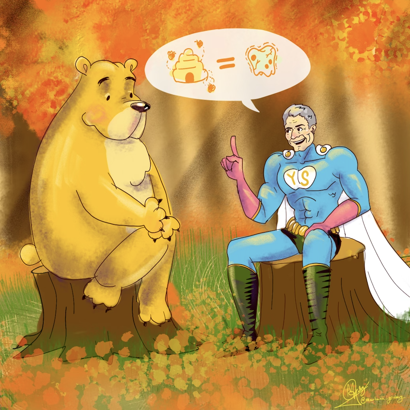
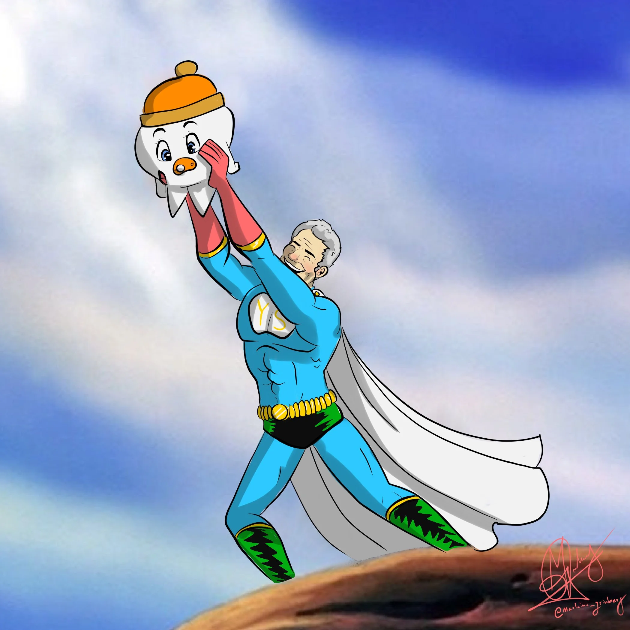
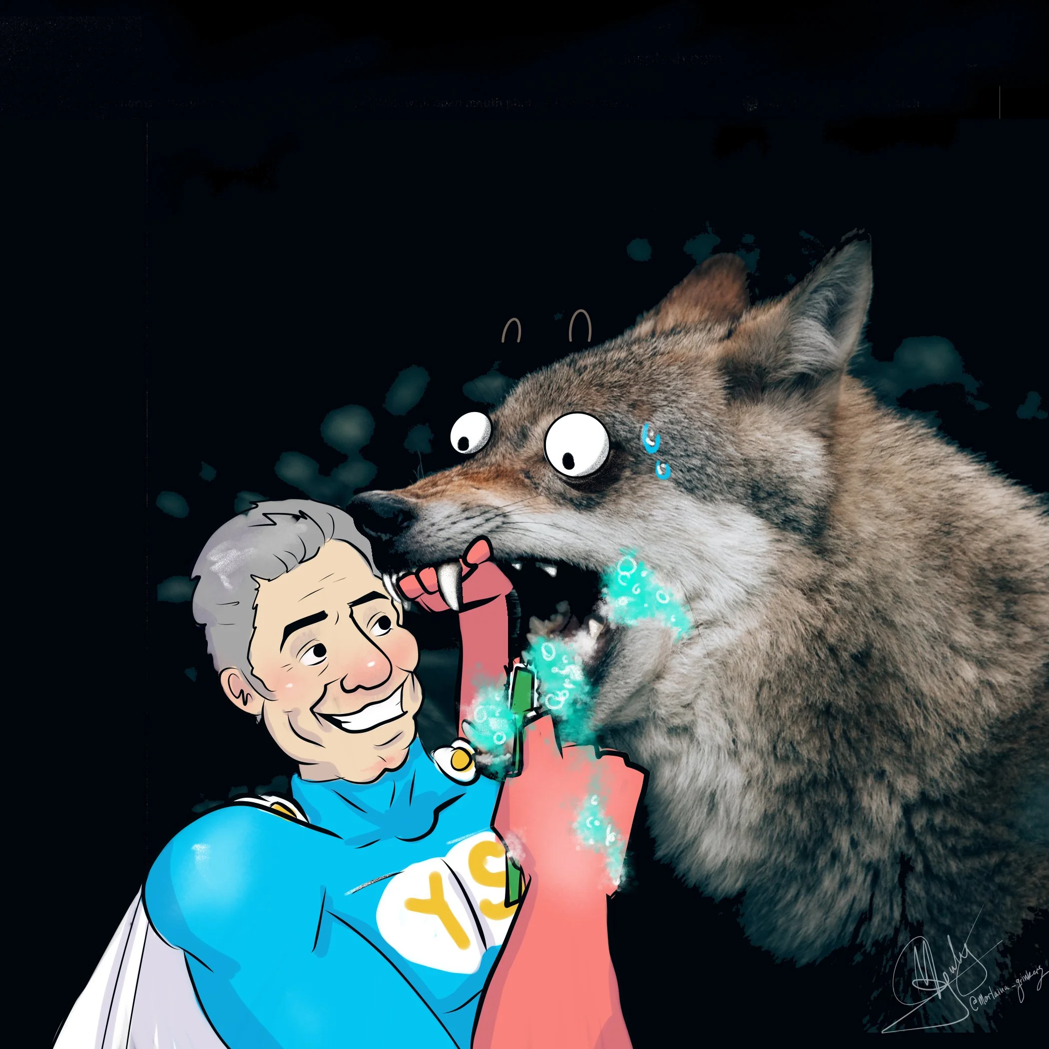
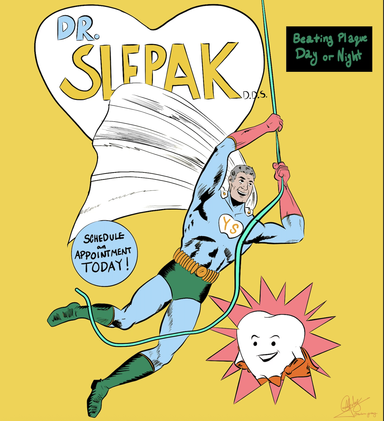
This also included creating outdoor signage for the office.
a new chapter
Just as I was starting to feel tapped out creatively, the office decided it was time for a full rebrand. They brought me in to lead the transition and expand my role beyond illustrations. I was tasked with;
Developing a completely new brand identity
Redesigning the website to reflect the updated vision
And creating a fresh, more strategic content structure for Instagram. It was an exciting shift that allowed me to think bigger and shape the brand on a much broader level.
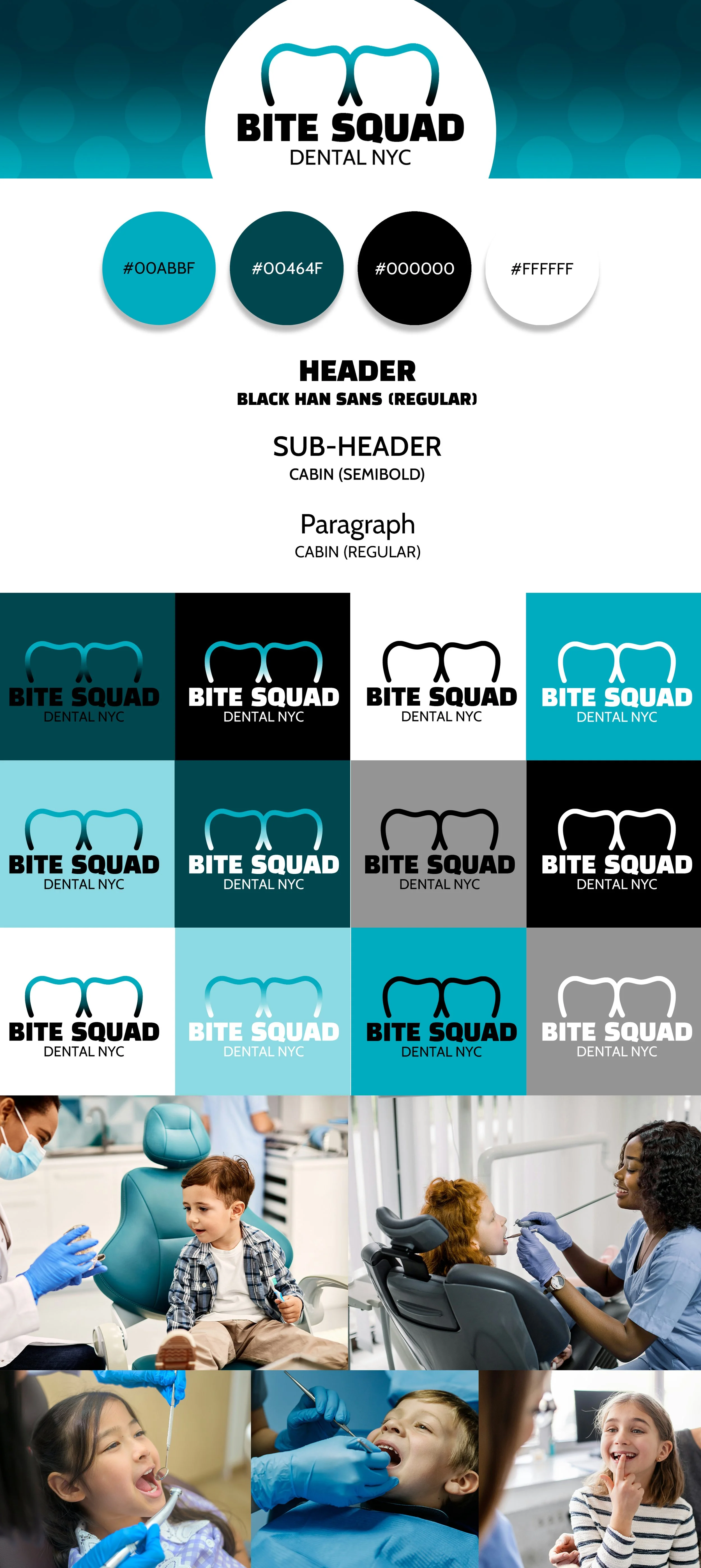
We decided to take the brand in a completely new direction visually, moving away from the bright orange palette to a fresh teal-based color story. The teal felt softer on the eyes, still vibrant and playful, and subtly tied back to toothpaste, which made it feel on brand without being too literal. It instantly gave the practice a cleaner, more modern energy.
For the logo, I explored several concepts before they gravitated toward a clustered tooth icon paired with a soft gradient treatment. From there, it was all about choosing typefaces that would bring the redesign together. We landed on a bold sans serif for strength and clarity, paired with a more playful, rounded secondary font that hinted at a comic-inspired feel. The combination kept the brand youthful and approachable while still feeling polished and professional.
branding redesign
old logo
new logo
a new online look
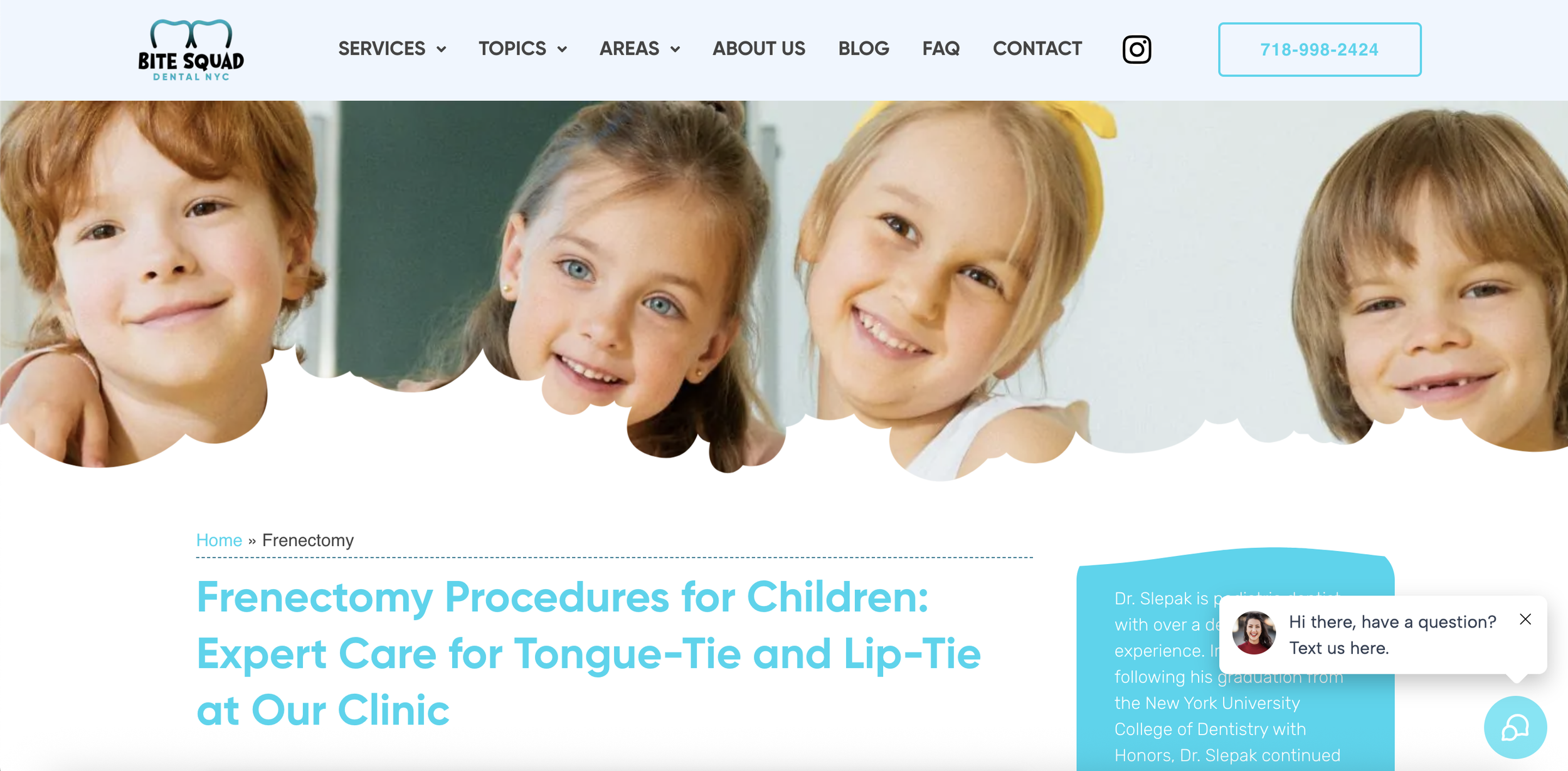
Once the new brand direction was finalized, I moved into designing a full website mockup to match the updated look and feel. I mapped out the visual layout, refined the color story, and made sure the new identity carried through every page. Working closely with a web developer, we brought the concept to life and transformed the site into something that felt cohesive, modern, and aligned with the refreshed brand vibe.
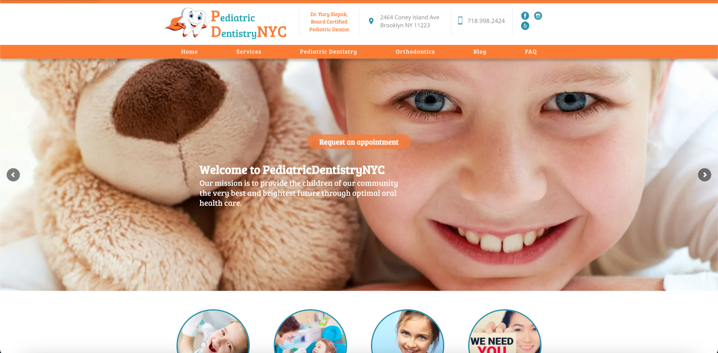
before
after
Instagram ready
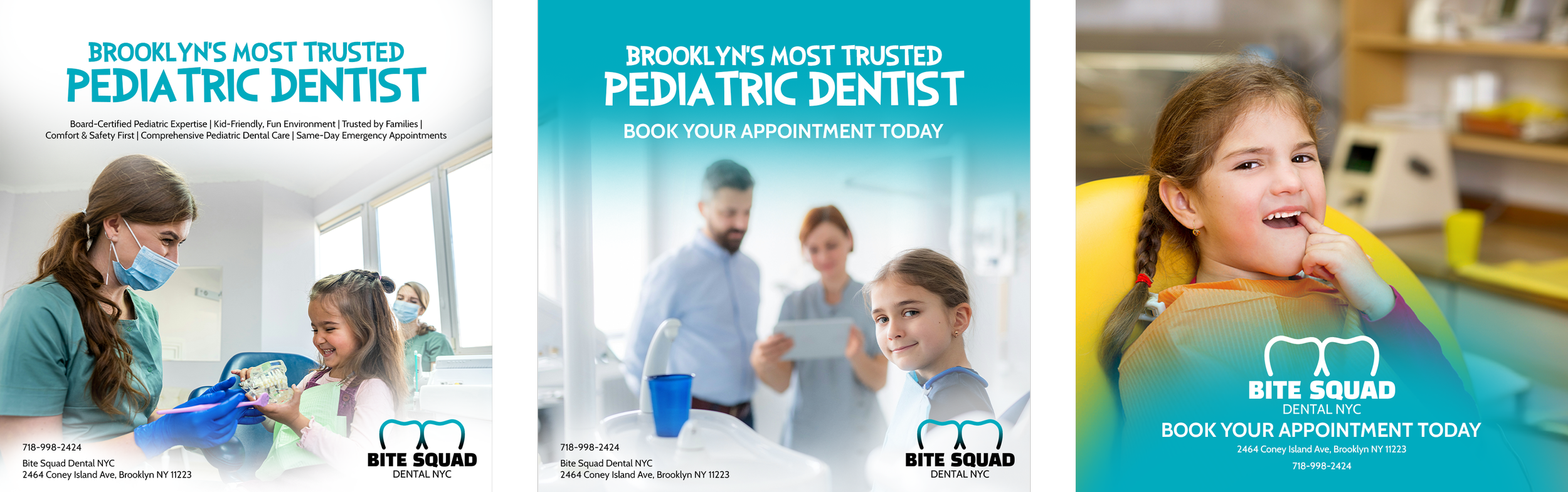
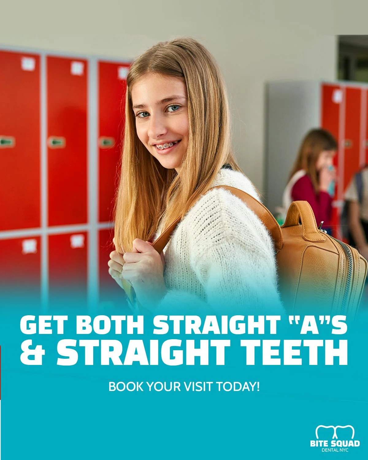
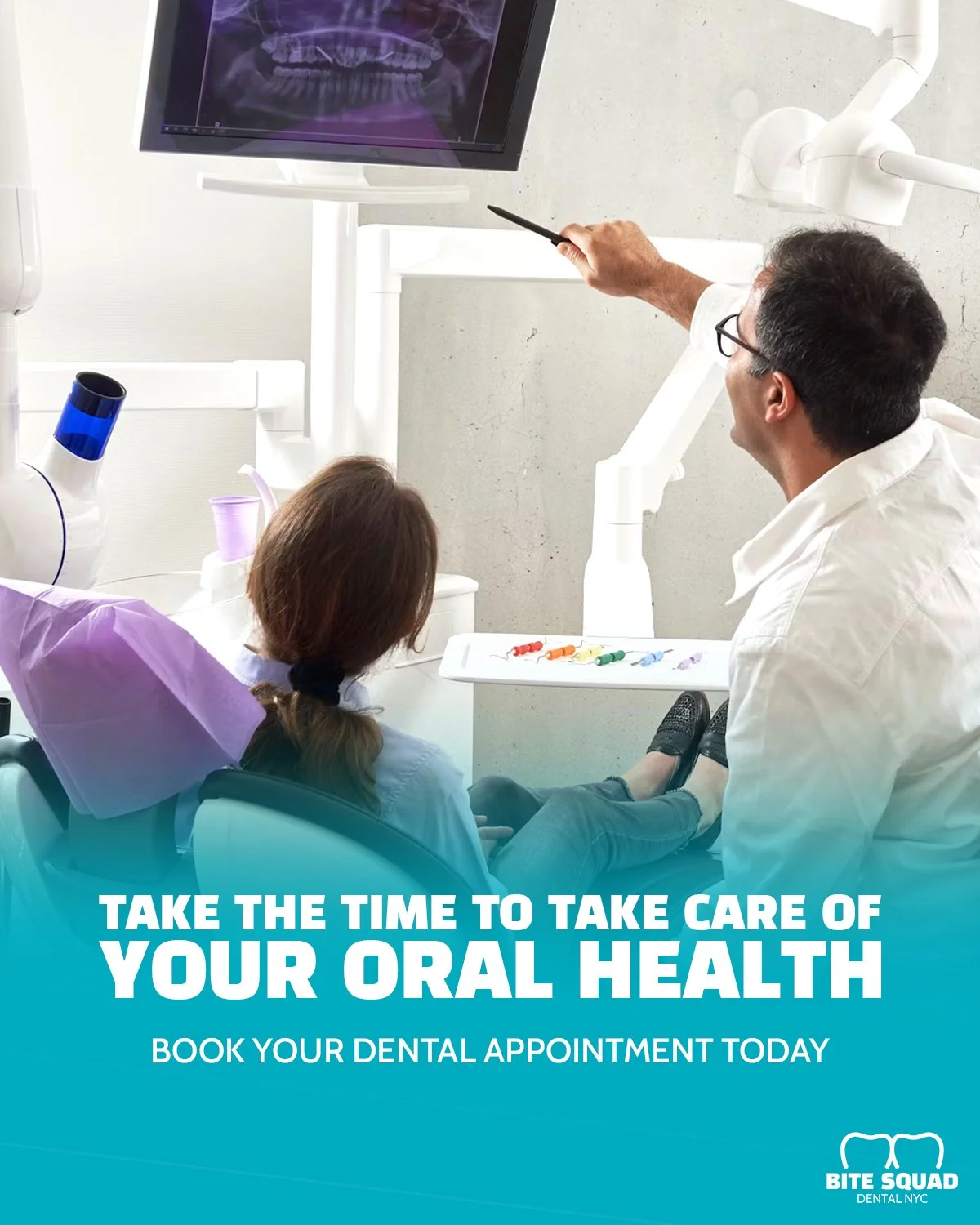
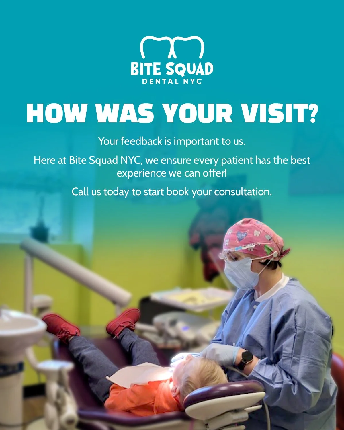
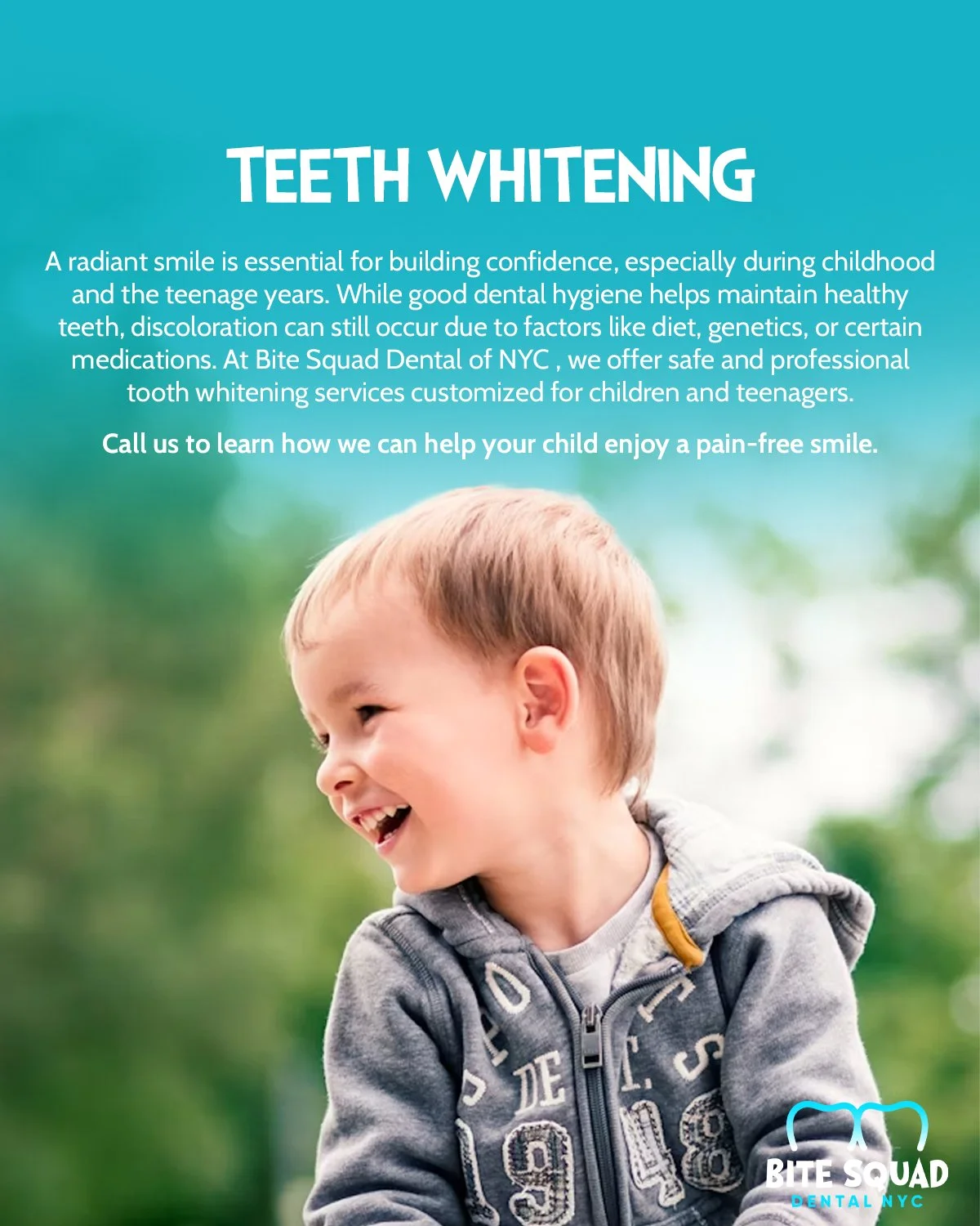
All the pieces were set, and it was time to build up new content. Stepping away from the drawings, I focused more on an editorial motif. This meant finding photos and focusing more on advertising the services and information the dental office provided.
I still incorporate witty humor while sticking to a new feed structure. I also make sure every post created has a matching story for more audience engagement. I believed that the best way to plan content is to split it into themes:
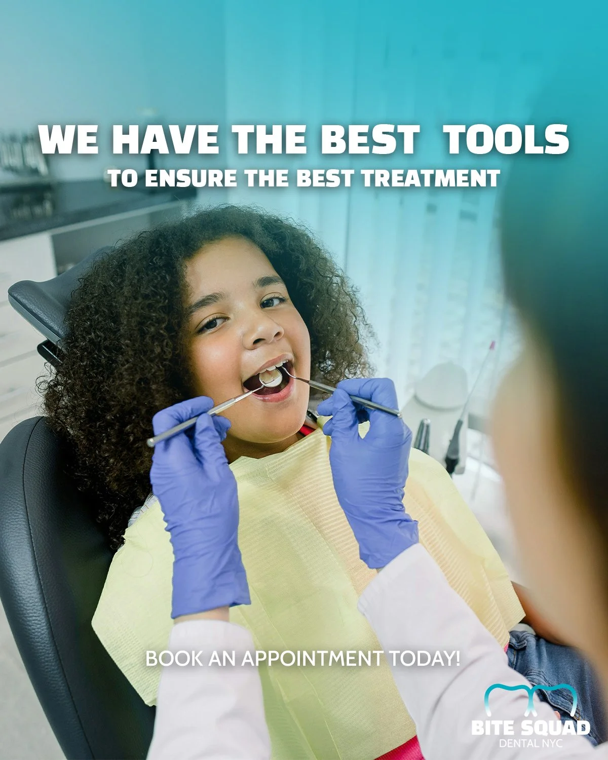
Scheduling an appointment
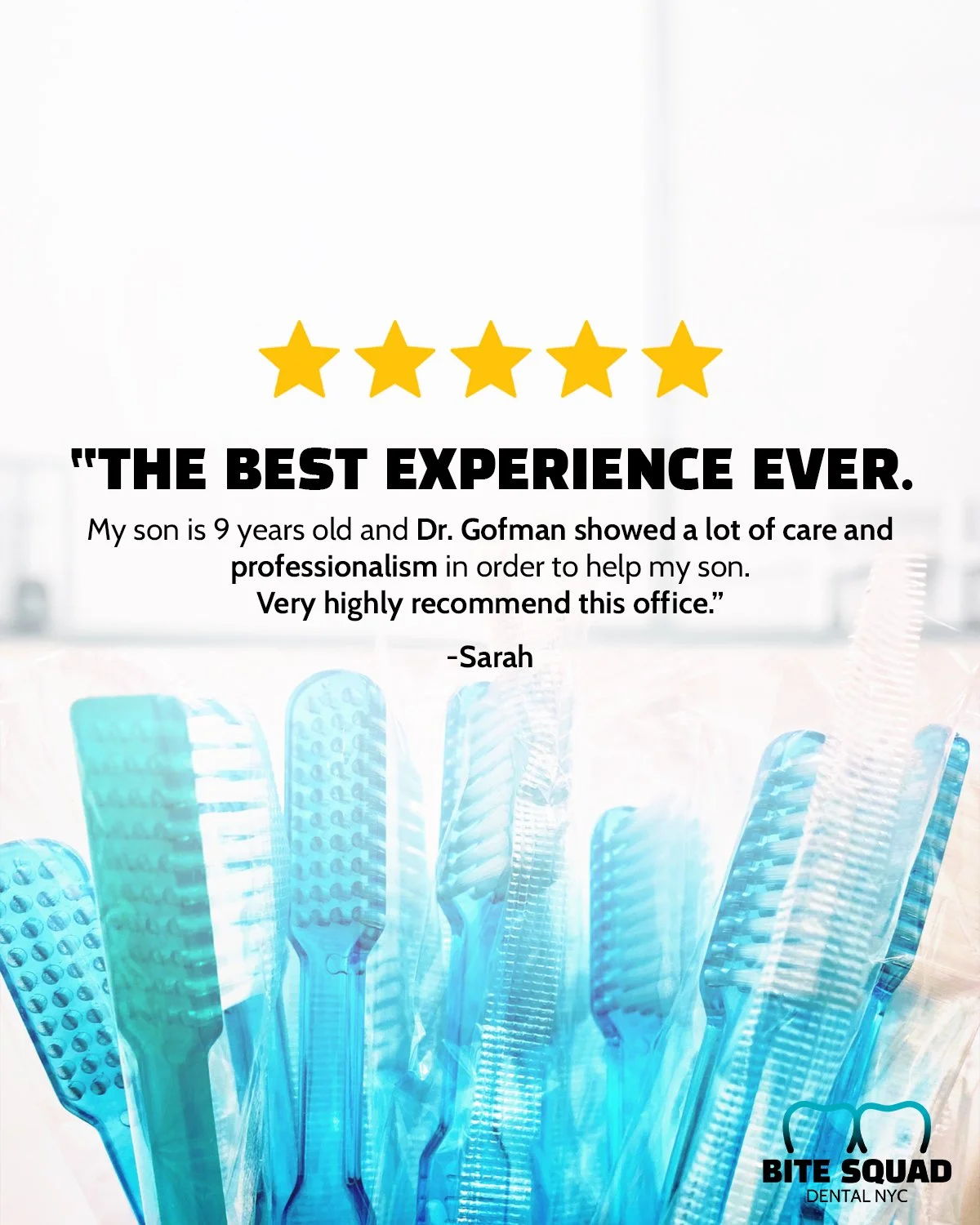
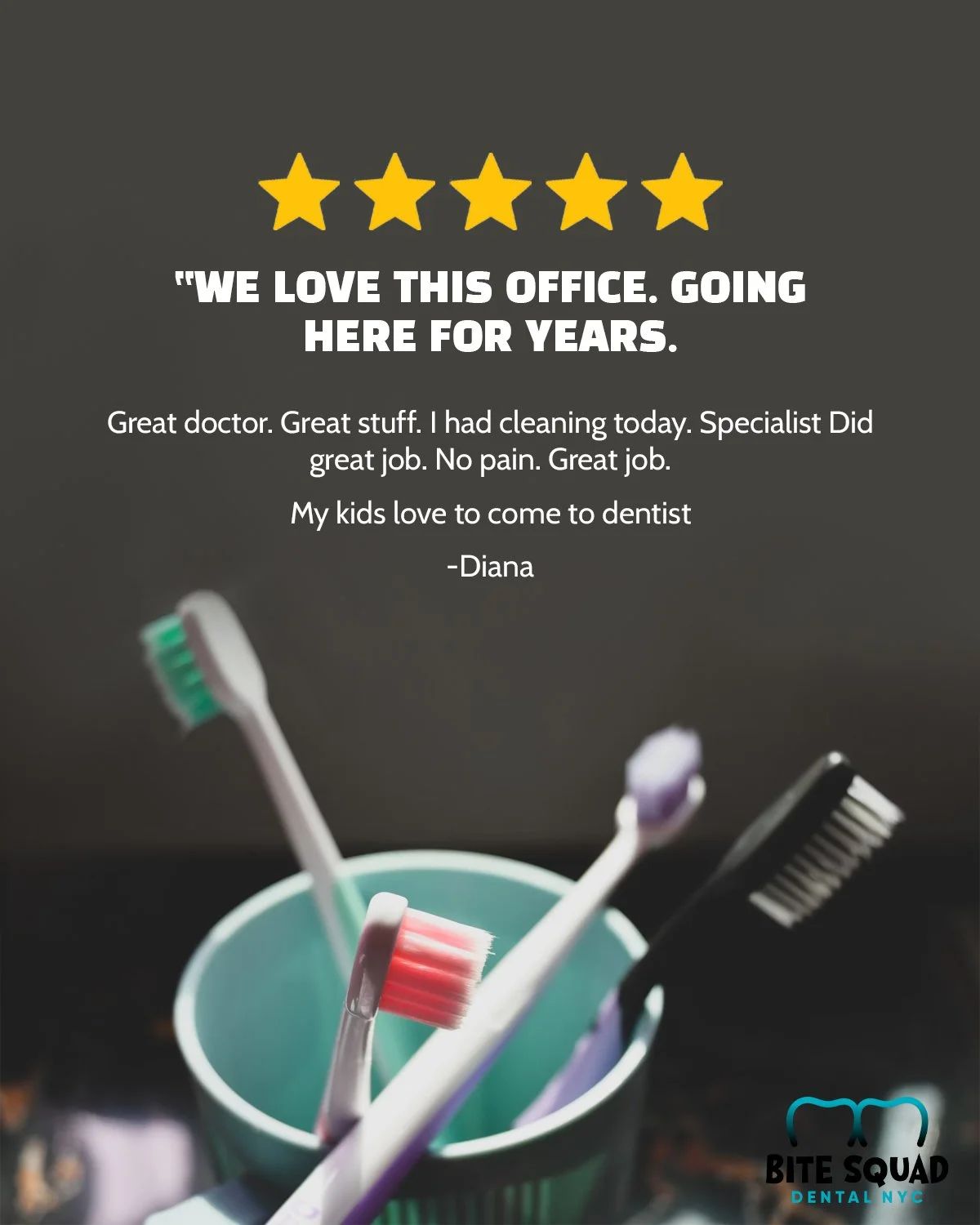
Reviews
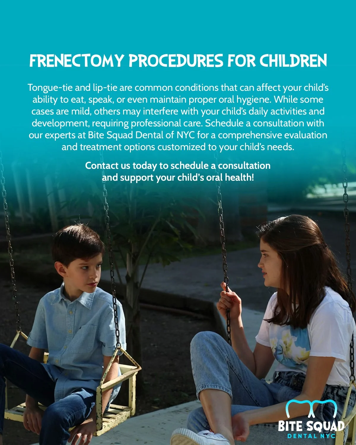
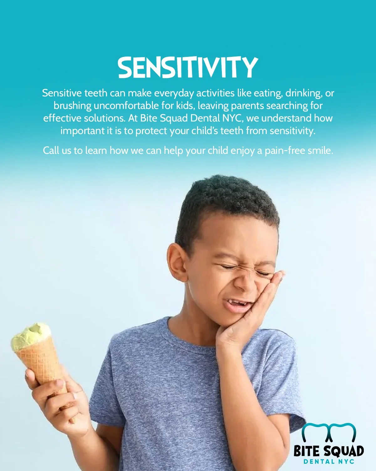
Services
About the office
FAQs
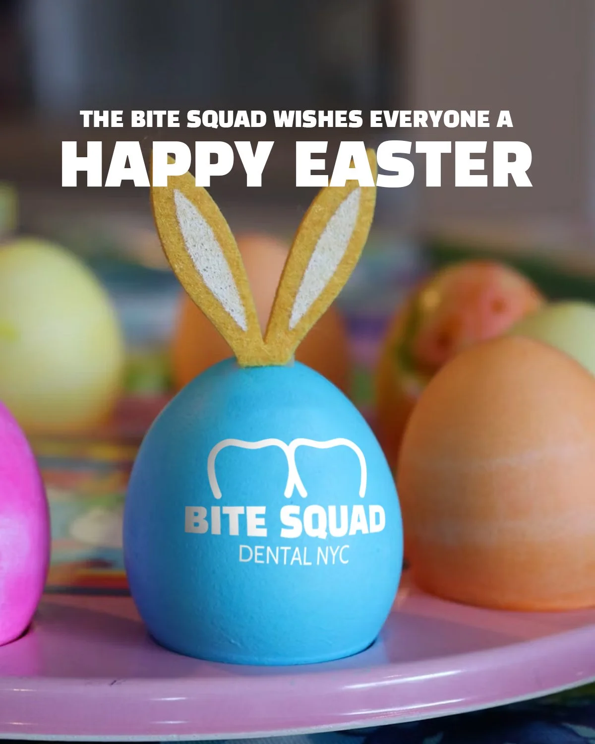
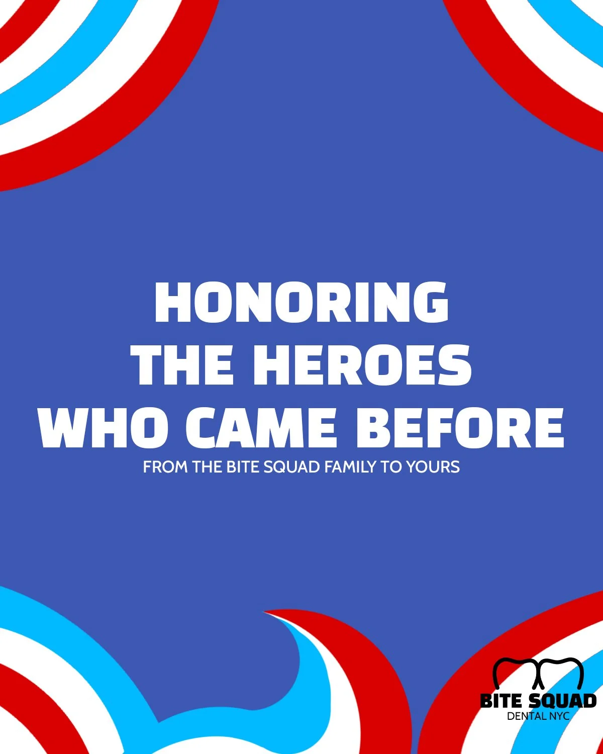
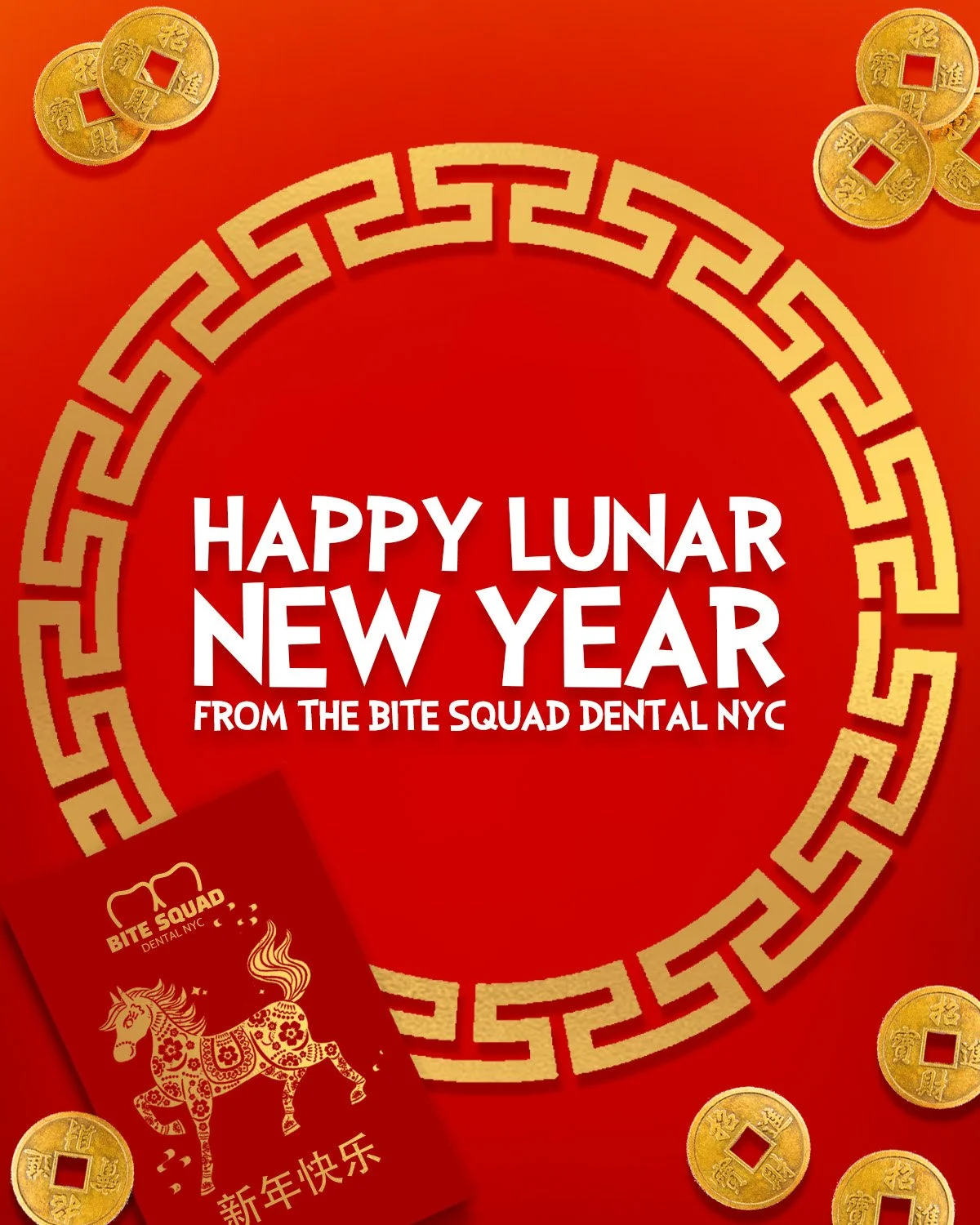
and holiday engagement

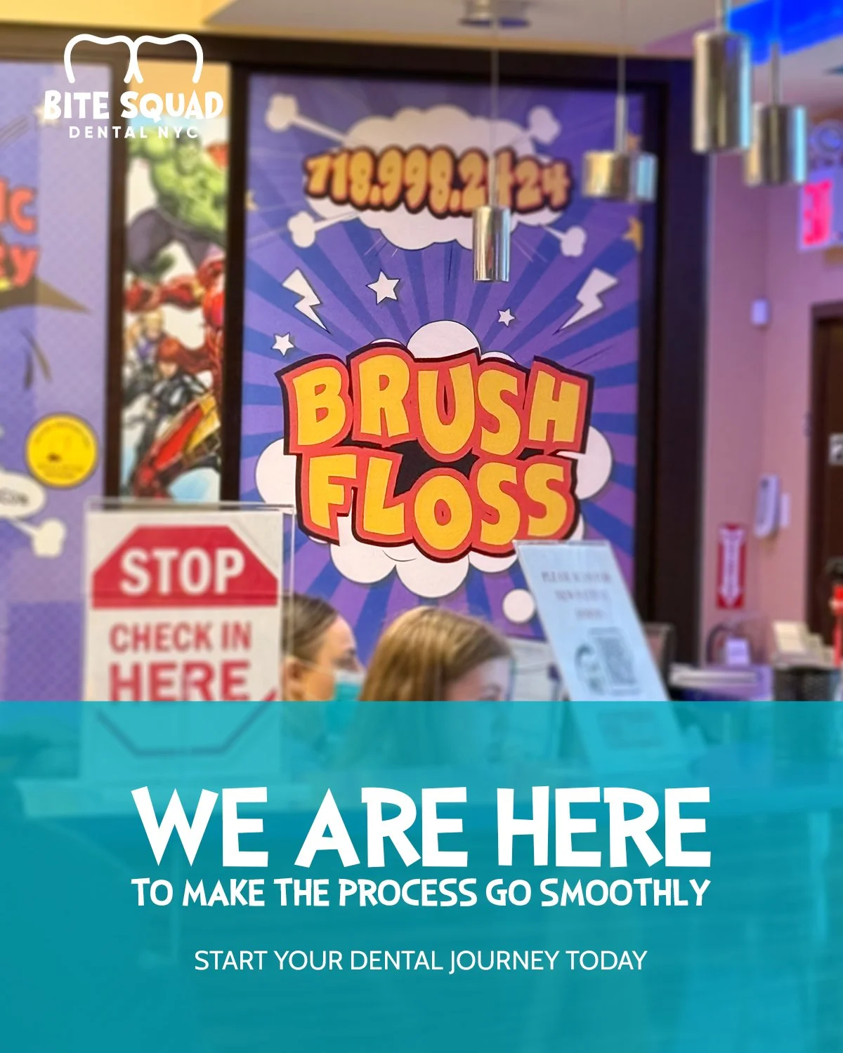
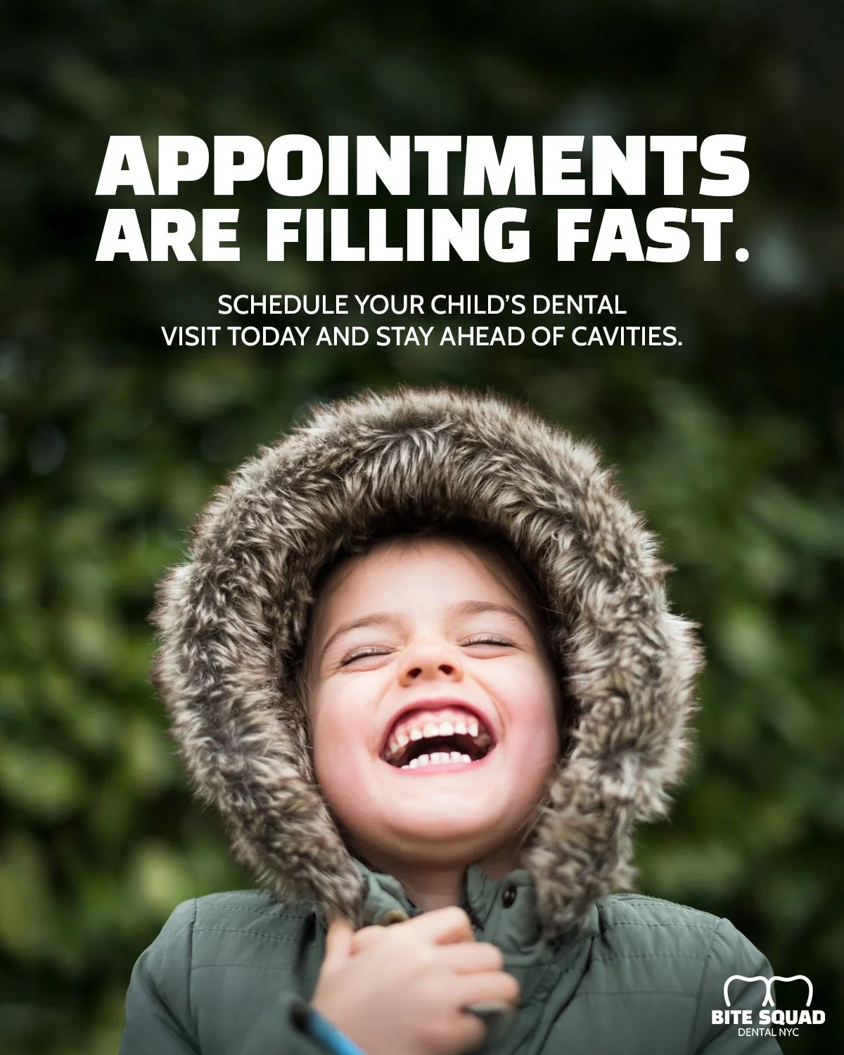

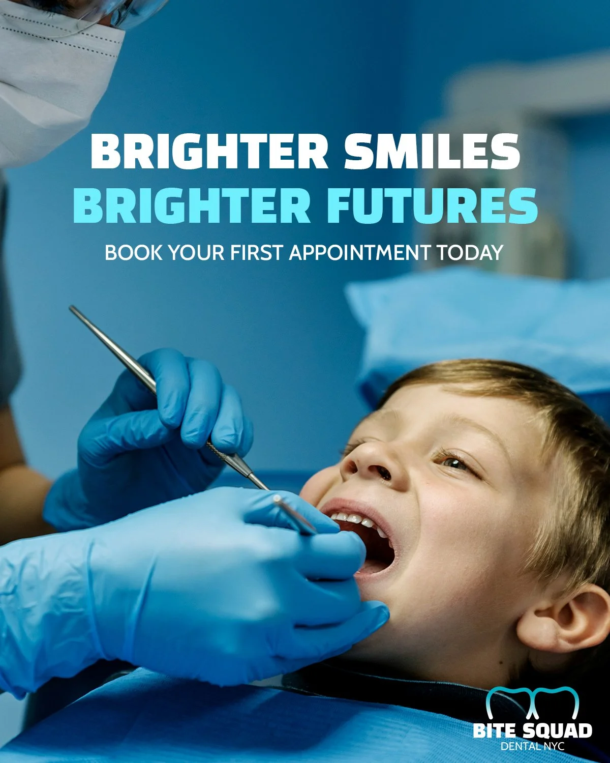
creating advertisements
I created a series of ads designed for both print and digital platforms, making sure the visuals and messaging translated seamlessly across each format. The goal was to expand our reach, drive more traffic to the website, and ultimately encourage new patients to book appointments.
It was also nostalgic to bring back the drawing motifs again.